High severity code review findings per 1,000 changes

Raw counts can be misleading.
If one repo changes 10 million lines and another changes 200k, the first will almost always show more problems, even if the codebase is actually in better shape. Volume alone distorts the comparison, so we needed a way to adjust for how much code was really changing.
To do that, we looked at suggestions tagged high or critical, grouped them by language, and divided that number by total totalChanges. The result is “high/critical suggestions per 1,000 changes.” We also removed groups with fewer than 50 PRs so the numbers would not be pushed around by tiny samples.
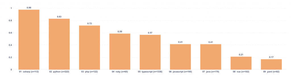
What we saw
| Language | High/critical per 1k changes |
| csharp | 0.98 |
| typescript | 0.93 |
| python | 0.73 |
| php | 0.61 |
| ruby | 0.58 |
| java | 0.52 |
| javascript | 0.37 |
| yaml | 0.23 |
| vue | 0.21 |
The values are low on purpose. A score of 0.93 means about 0.93 high or critical suggestions for every 1,000 changes, which comes out to roughly one every 1,075 changes. For csharp at 0.98, it is about one every 1,020 changes.
Even with the scale compressed, the spread is still noticeable. csharp at 0.98 versus vue at 0.21 is a 4.7x difference. That does not mean one language is “bad” and another is “good,” but it is enough of a gap to justify a closer look, especially when the sample size is solid.
I would treat this as a directional metric. It is useful for spotting drift, comparing patterns inside the same environment, and deciding where to investigate further. I would be careful not to turn it into a ranking of languages, because that skips too much context.
What makes this more useful in practice is how you pair it with other cuts of the data. Tracking it over time by repo or team is usually more revealing than looking at a single snapshot. Keeping PR count visible next to the chart also helps, because a group with a large number of PRs is easier to trust than one that barely cleared the cutoff. Breaking the metric down by labels such as bug, security, or performance gives it more texture too. The total tells you how much is happening, and the labels help show what kind of problems are driving it.
I would also sanity-check what counts as “changes” in each repo. Generated files and formatting-only commits can inflate the denominator without changing actual risk, which can make the metric look cleaner than it really is.
If I were publishing this, I would keep the presentation simple: a horizontal bar chart sorted by “high/critical suggestions per 1,000 changes,” with PR count visible alongside it. I would also want to split the view by PR size buckets (0–49, 50–199, 200–499, 500–999, 1000+). That makes it easier to separate what is coming from very large PRs and what still appears even in smaller ones.